The Urban Blueprint Office – A Q&A
If you’ve been following along on our social channels and subscribing to our newsletters, you’ll already know that Urban Blueprint has a new brick-and-mortar home! For several months now, we have been settling into our Leslieville office at 1109 Queen St. East. Although we take all of our projects to heart, this one was particularly special as it was our first commercial space to become the “face” of our company. To further illustrate the stunning photos of the space, taken by our photographer pal, Alex Lukey, we decided to take a deeper dive into the nitty gritty details that were involved in the creation of our office with a little Q + A…
What made you choose Leslieville?
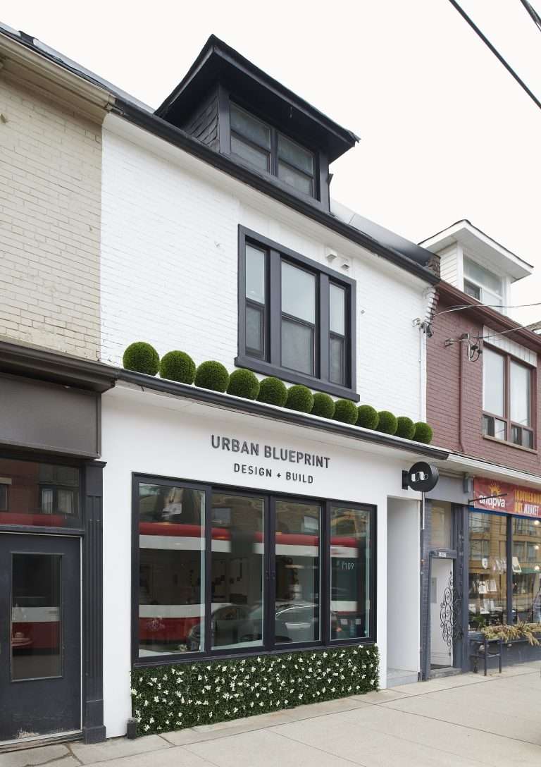
When initially discussing the prospect of opening up our own commercial space for Urban Blueprint, the big question was where? Although we entertained a few options, we were ultimately drawn to Leslieville, as it’s very central in relation to a lot of our projects. We spend a lot of hands-on time on building sites so it was important to us to be able to easily hop on the Lakeshore and head to the Gardener or DVP to get to many other areas of Toronto and surrounding areas. We have projects in Mississauga, Rouge Valley, Lawrence Park, Rosedale etc. etc. so the location was key.
Beyond convenience though, we simply like Leslieville! It’s a very vibrant neighbourhood filled with amazing restaurants, boutiques, cafes and a lot of great work-live loft spaces. In fact, we’ve done three projects in the area, including a Bloc East Salon around the corner from us, which is in one of these live-work lofts. All in all, we have great neighbours here that have become friends and we look forward to watching and being a part of Leslieville’s growth and evolution.
What was the inspiration behind the design and aesthetic of the interior of the office?
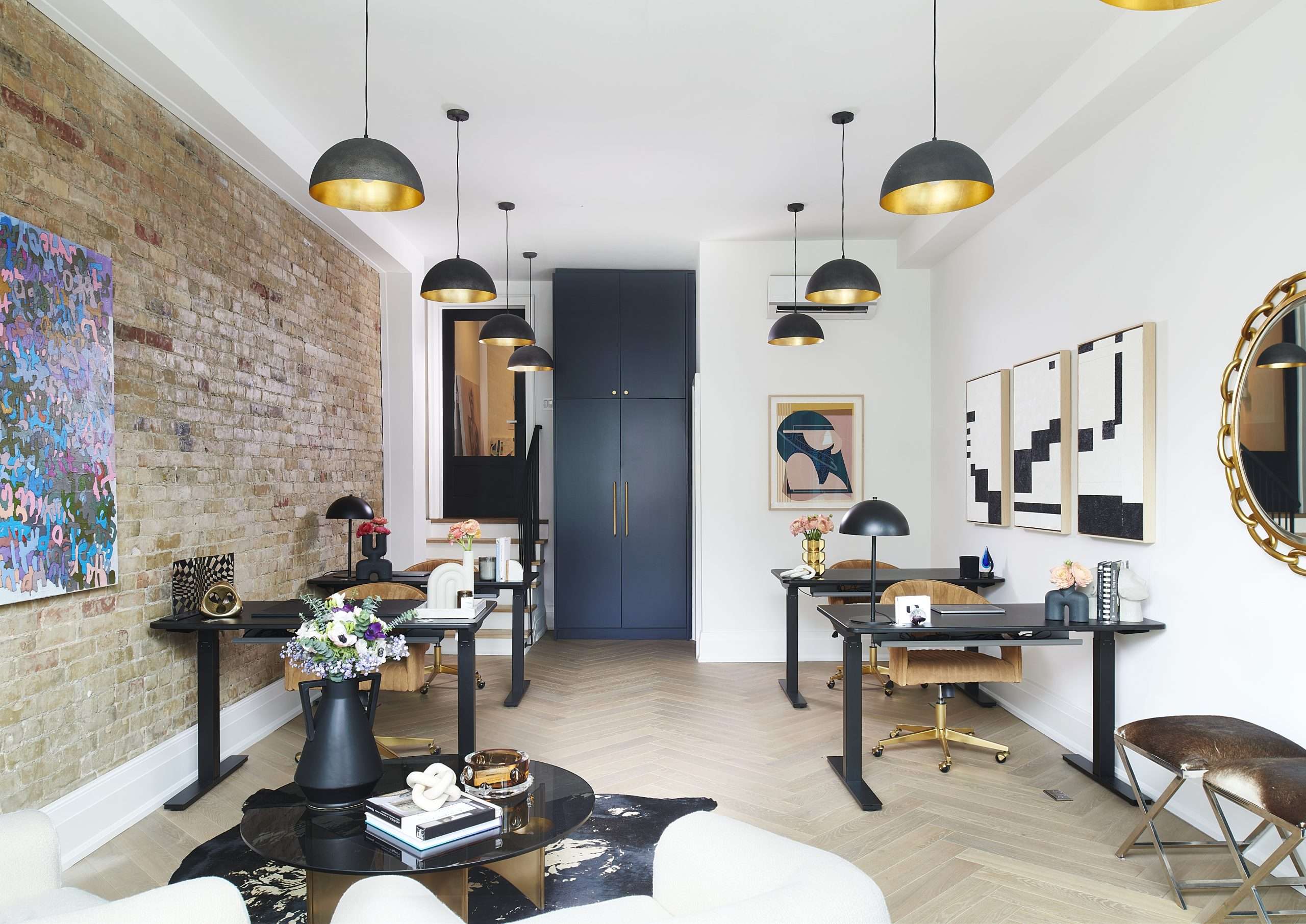
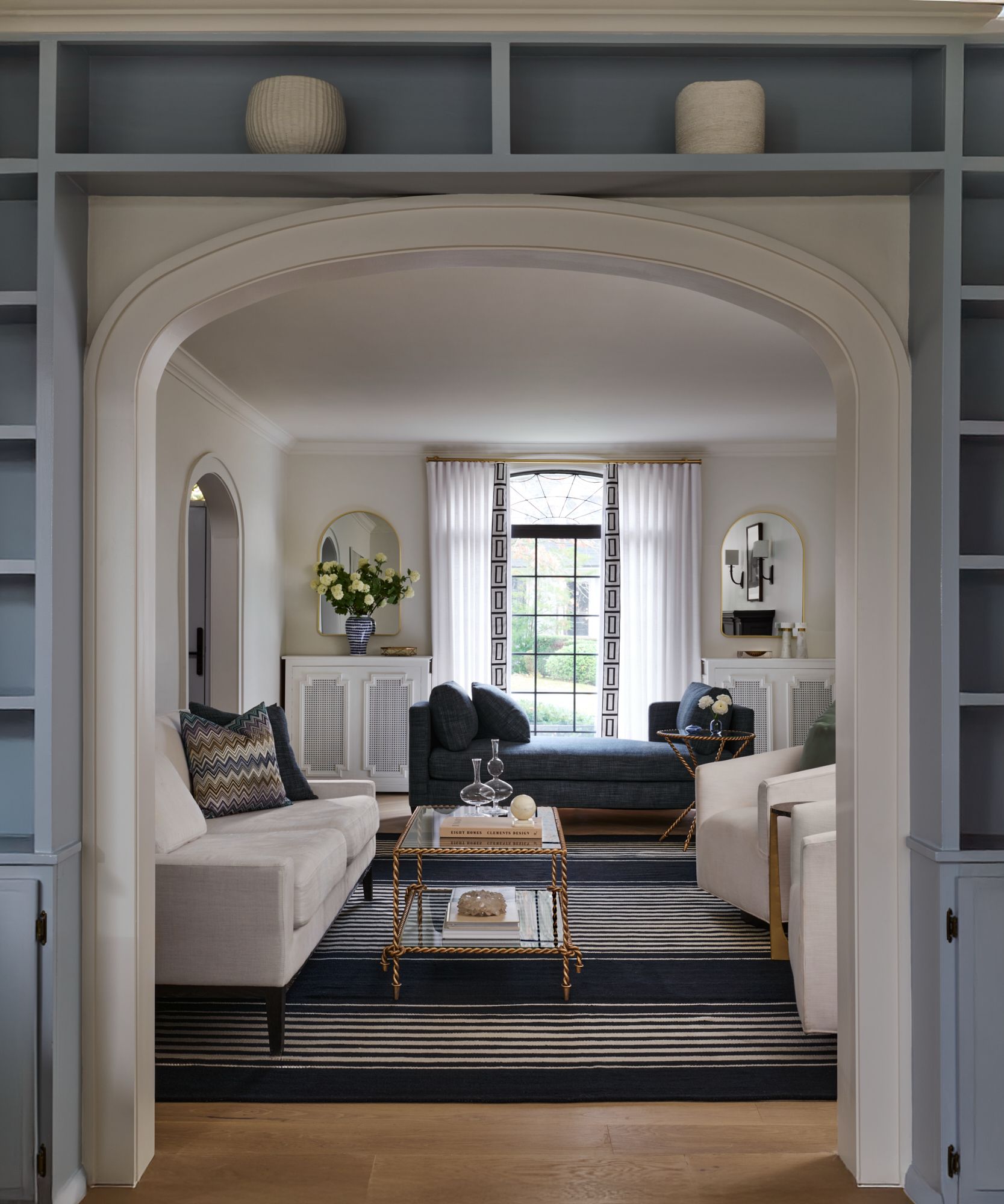
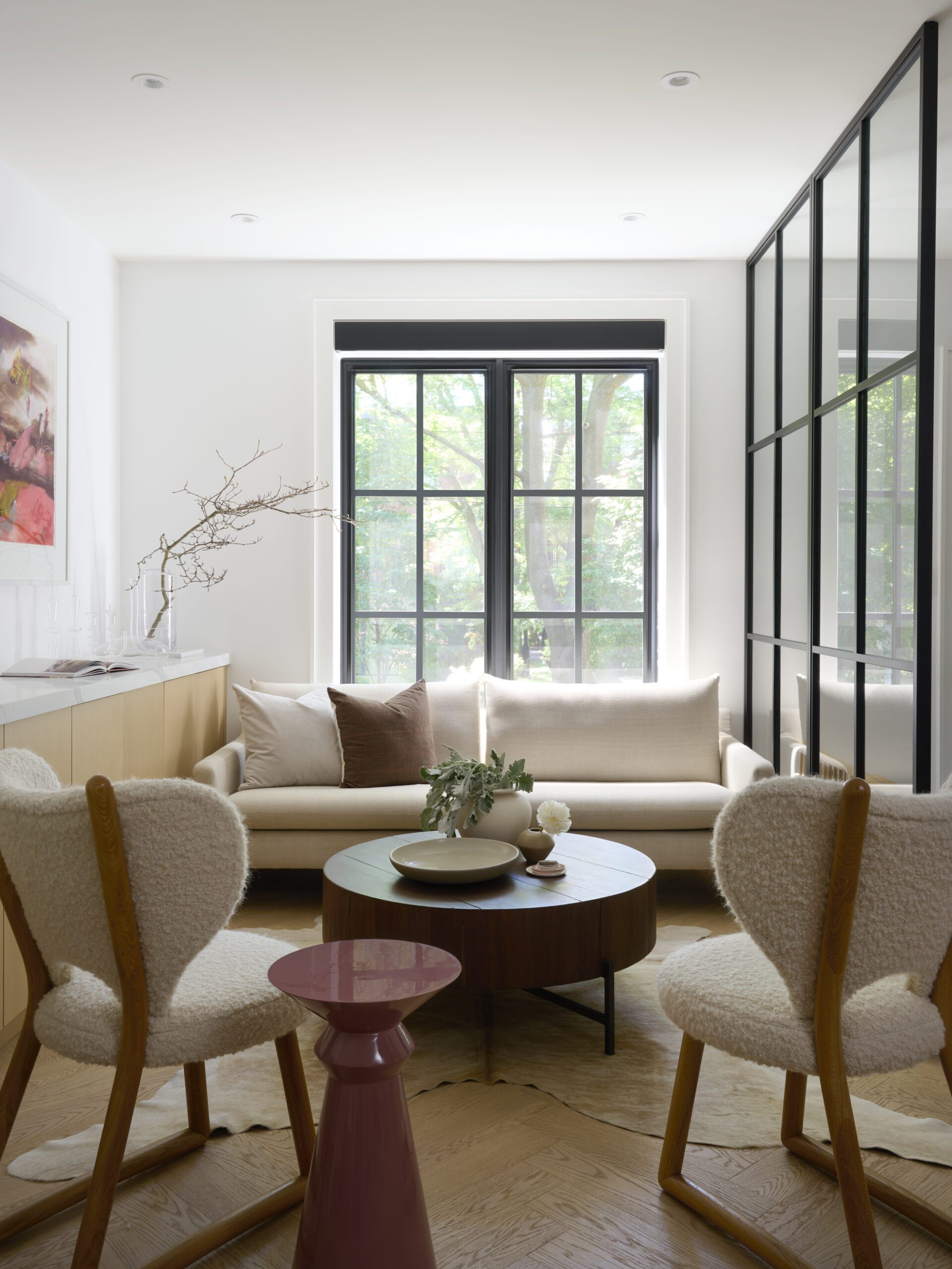
When designing the space, it was about finding the right balance of functionality and our aesthetic. We wanted to work in a space that inspires and motivates us and one that is representative of the work that we do in our client’s homes. From time to time, we host prospective or current clients in our office for meetings so it was incredibly important that the office not only meets practical needs but also showcases our abilities.
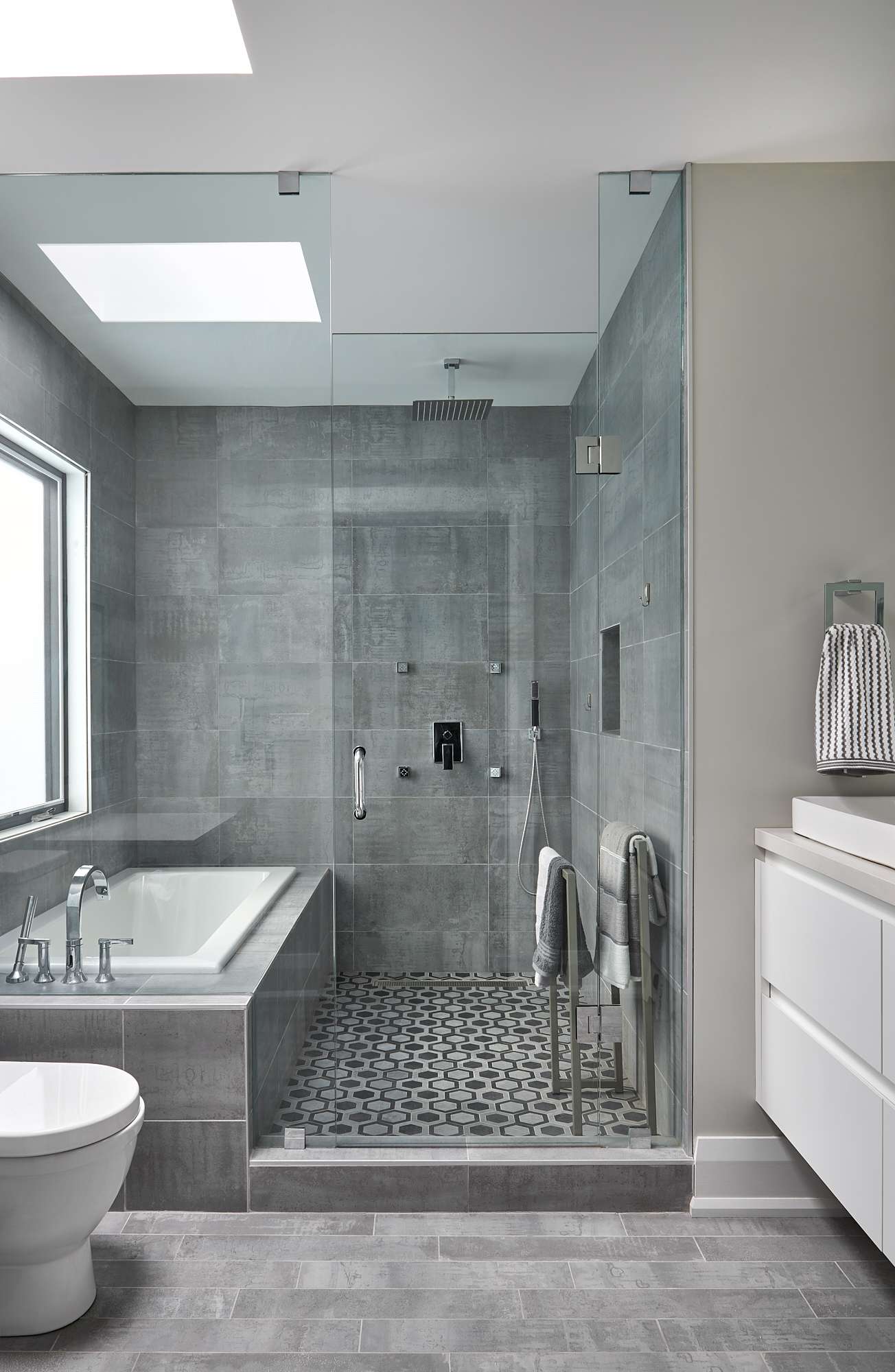
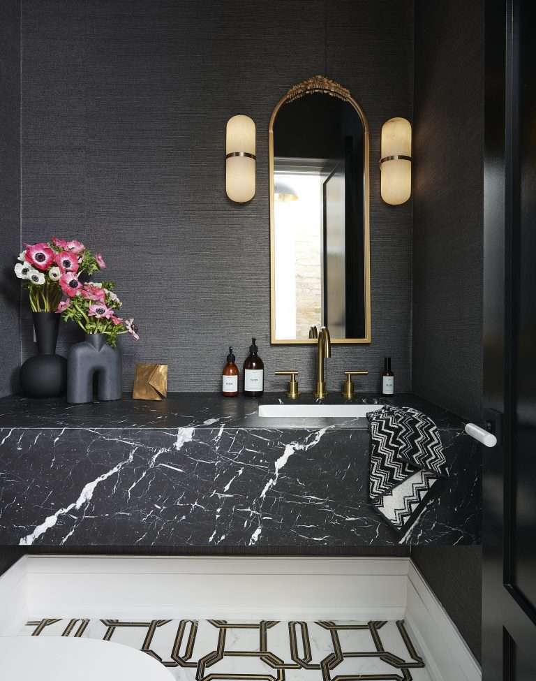
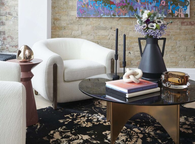
The office features an exposed brick wall, which we love. It’s very urban and representative of the area and also informed a lot of our design decisions and fixture selections. As an elegant juxtaposition with the brick, we selected light Moncer herringbone floors, which we have also used in many of our client’s homes. The fixtures and hardware are of gold and brass tones with contrasting black, our railing is black iron, we selected a Nero Marquina marble and chain mosaic marble tiles with brass inlay from Saltillo Tile for our powder room. To the back, our brand-new kitchen features millwork from Altima Kitchens, along with porcelain countertops and backsplash from Marble Trend. The look as a whole is residential and yet functions incredibly well as an office. Overall, the vibe is urban but sophisticated and totally us.
What did the exterior look like originally? What had to be done to transform it into its current state?

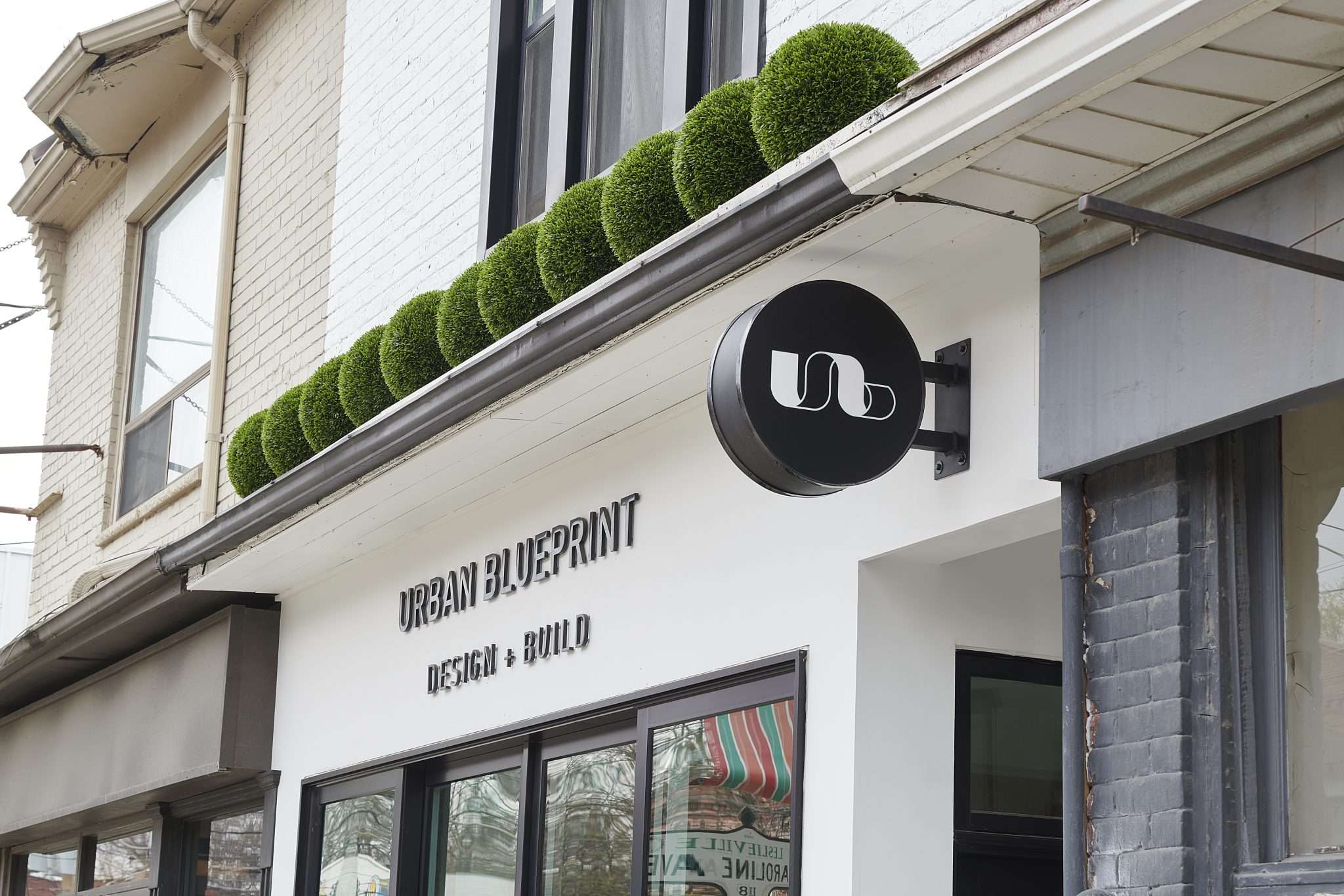
To put it mildly, the exterior was terrible! The building had previously been used as an Airbnb and therefore had not been set up to function as a retail space. Prior to demolition, we did a 3D rendering to see how it would look painted white, with black accents. We found inspiration from the retail spaces of brands we love such as Jo Malone, Aesop and various stores along Bleeker Street in New York. The goal was to give it a really clean and crips but welcome feel.
In addition to painting the facade of the building, we also completely demoed the front in order to install our large sliding windows. This not only completely transformed the look and feel of the building but it also lets in tonnes of light and fresh air.
Where did some of the key pieces in the office come from?
For obvious reasons, we were very particular when selecting our desks. Although the look was important, anyone who has a job that involves sitting at a desk for hours understands that comfort and practicality is paramount. For this reason, we selected sit-stand desks from Autonomous. They are clean and simple and can easily be adjusted to various heights.
For furniture, we found several of our pieces from CB2 and Visual Comfort. They tend to be some of our go-to’s as they offer great quality and a style that appeals to us. Our lighting in the bathroom is from one of our favourite designers, Kelly Wearstler, and many of our pieces like our console table and mirror, for example, can be found on our sister company’s website, Homekin.
Comparing this project to some of your residential projects, what are some of the key factors you had to consider when making selections?
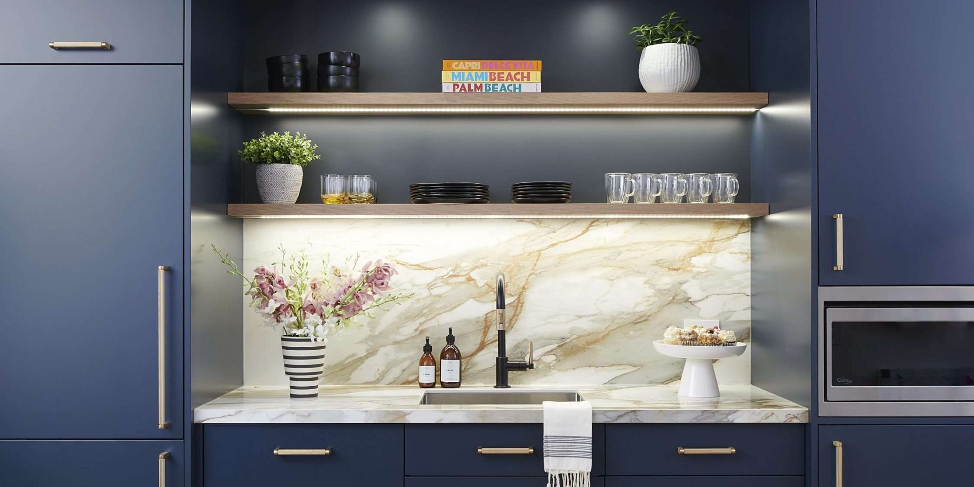
Although we wanted the space to have the look and feel of our residential projects, everything we selected had to be durable enough to withstand the wear and tear of a commercial space. Our floors, although they are herringbone by Moncer (a brand we use in many residential projects) they are of commercial grade. The same thought was put into our kitchen. Instead of a natural stone, went with a porcelain product from Marble Trend for our countertop for easy cleaning and maintenance.
Have more questions about our office or services? Feel free to get in touch or drop by in person!

