Embracing “Risks”- 4 Design Elements We’ve Seen in 2024
Embracing “Risks”- 4 Design Elements We’ve Seen in 2024
As each year passes, the UB team observes trends and aesthetics come and go. Generally, from a global perspective, Toronto tends to lean towards a more “safe” and conservative place on the design spectrum. Perhaps the long winter months and lack of sunshine draw us towards neutral tones. Whatever the reason, in the words of Bob Dylan, “The times they are a changin’.” We are witnessing a significant shift in our clients’ willingness to venture beyond the safe zone of 50 shades of grey and white! No longer limited to interior design magazines, perspectives have broadened with access to a plethora of design inspirations. Our clients now share magazine cut-outs, Pinterest boards, saved Instagram photos, and their travel photos, often from outside the continent. This shift not only results in exhilarating finished projects but also drives our creativity and motivates us to constantly innovate and push boundaries.
Here’s some of what we’ve seen so far in 2024:
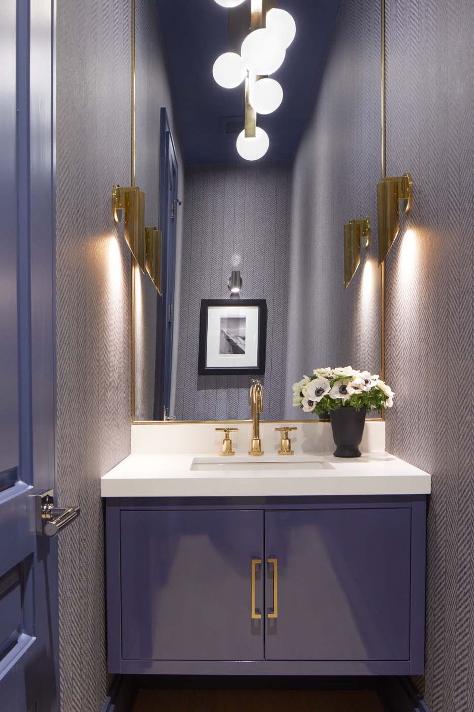
Throughout the home, custom doors with a circular design elevate the ambiance, adorned with Emtec brass and marble hardware and handles. Behind these doors lie hidden treasures, like the blue Missoni jewel box—a vibrant oasis born from our client’s love for this captivating wallcovering. This unexpected splash of colour infuses charm into the neutral palette, creating a guest bath that doubles as a powder room fit for discerning company. Pulling from one of the various blue hues in the wallcovering, we colour-matched paint for the custom vanity, as well as the door frame and baseboard. Plaster white sconces by Julie Neill sourced from Visual Comfort flank the gold-frame mirror adding femininity, while Matthews Studio pulls with brass and amber crystal add a particularly special ornamental element.
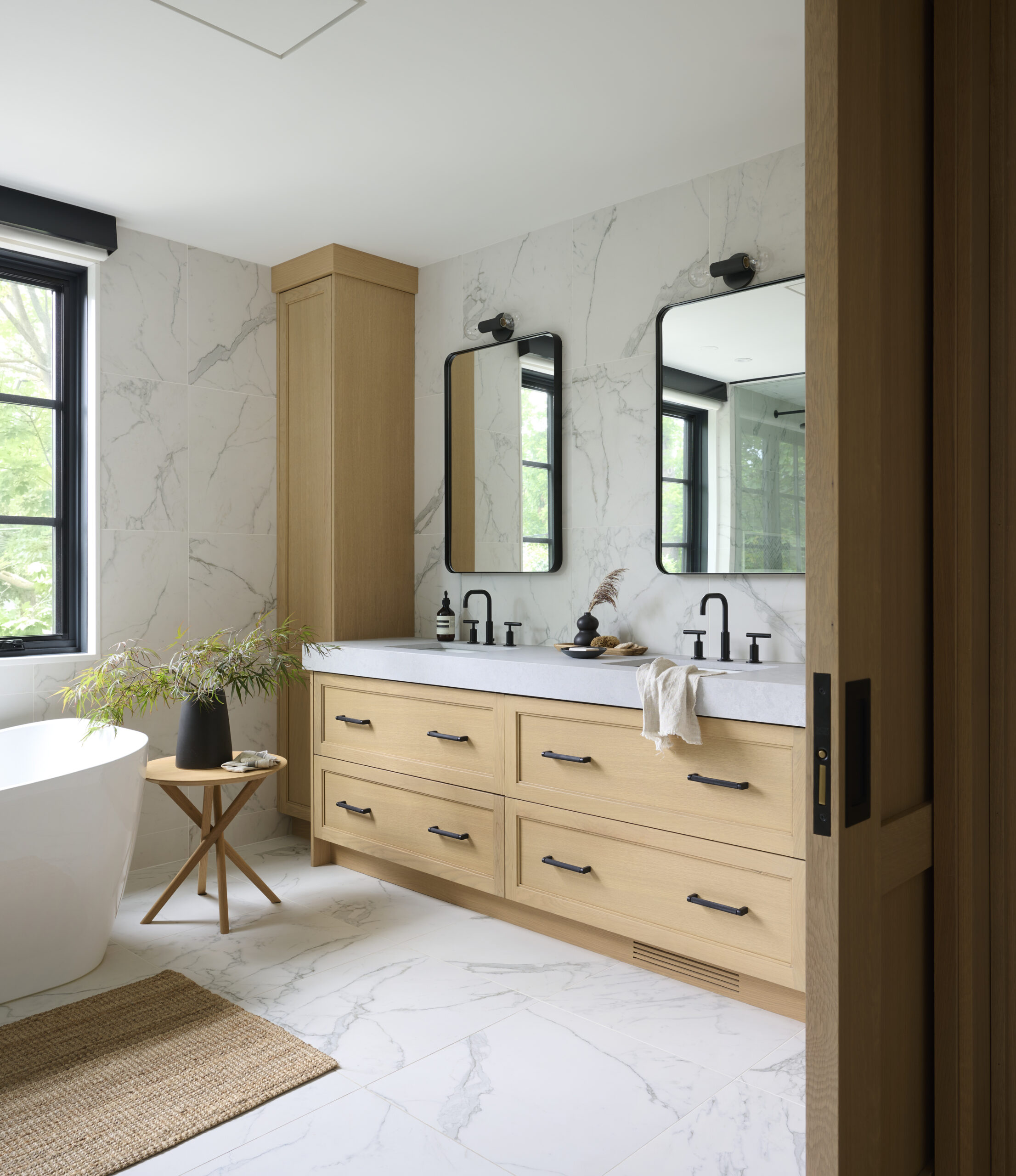
In the master bath, a neutral palette reigns supreme, while intricate details steal the spotlight. A marble mosaic floor with mother-of-pearl inlay exudes sophistication, complemented by Perrin & Rowe fixtures from England, marrying timeless elegance with modern functionality.
Experimenting with Paint
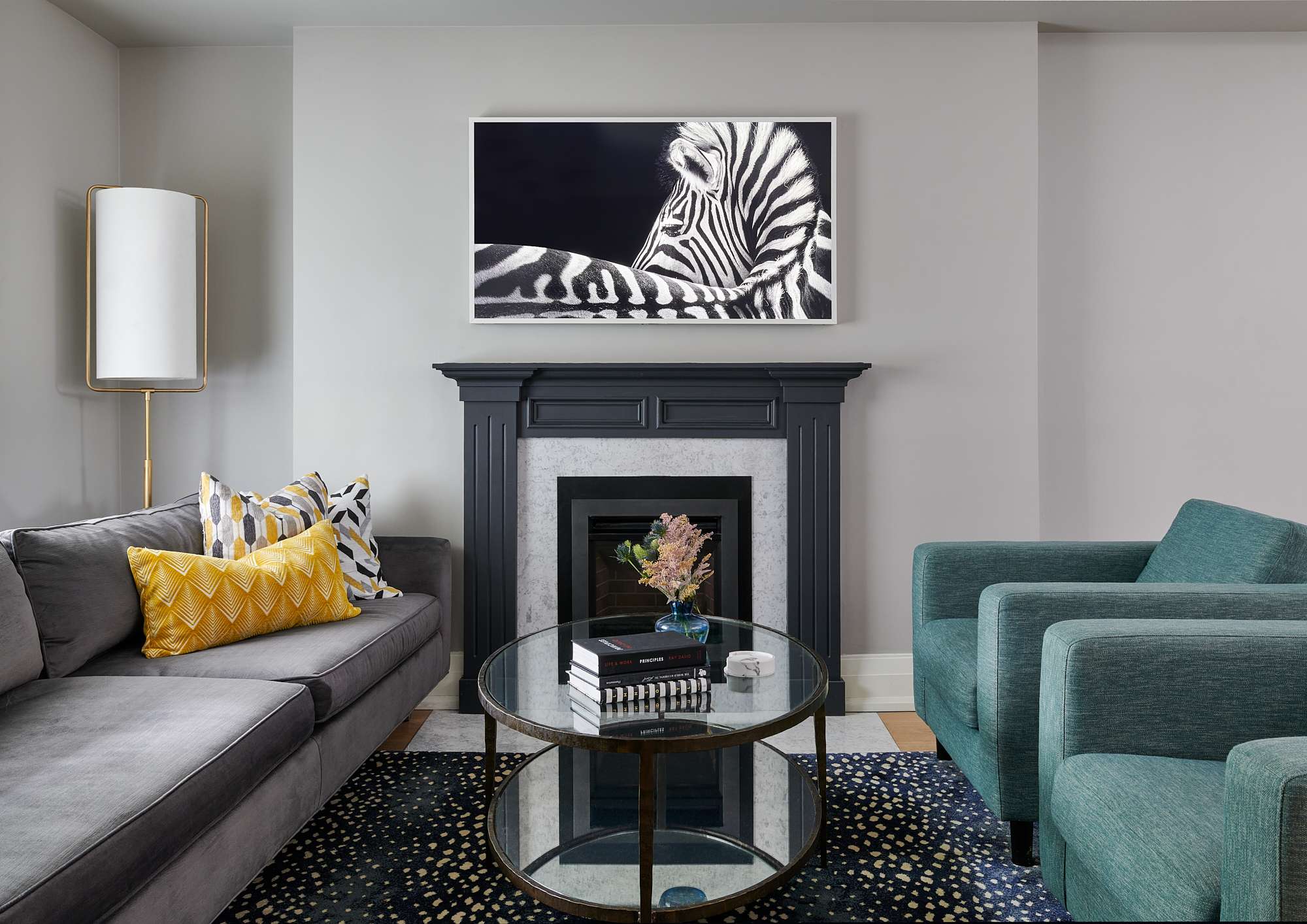
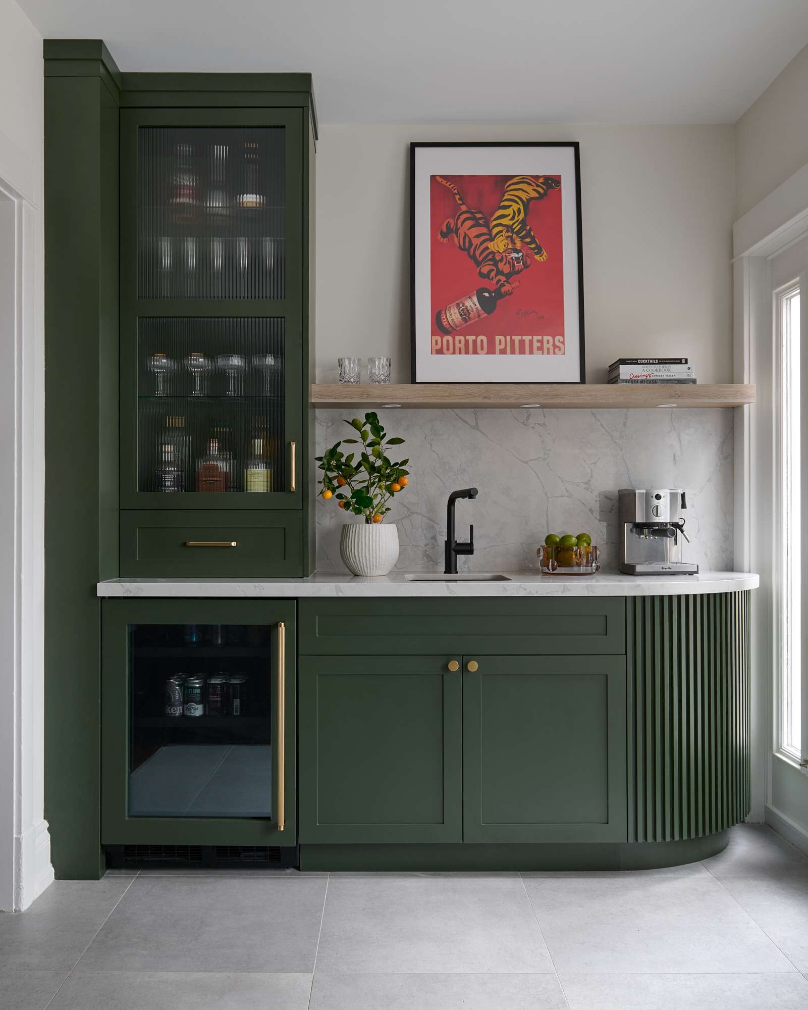
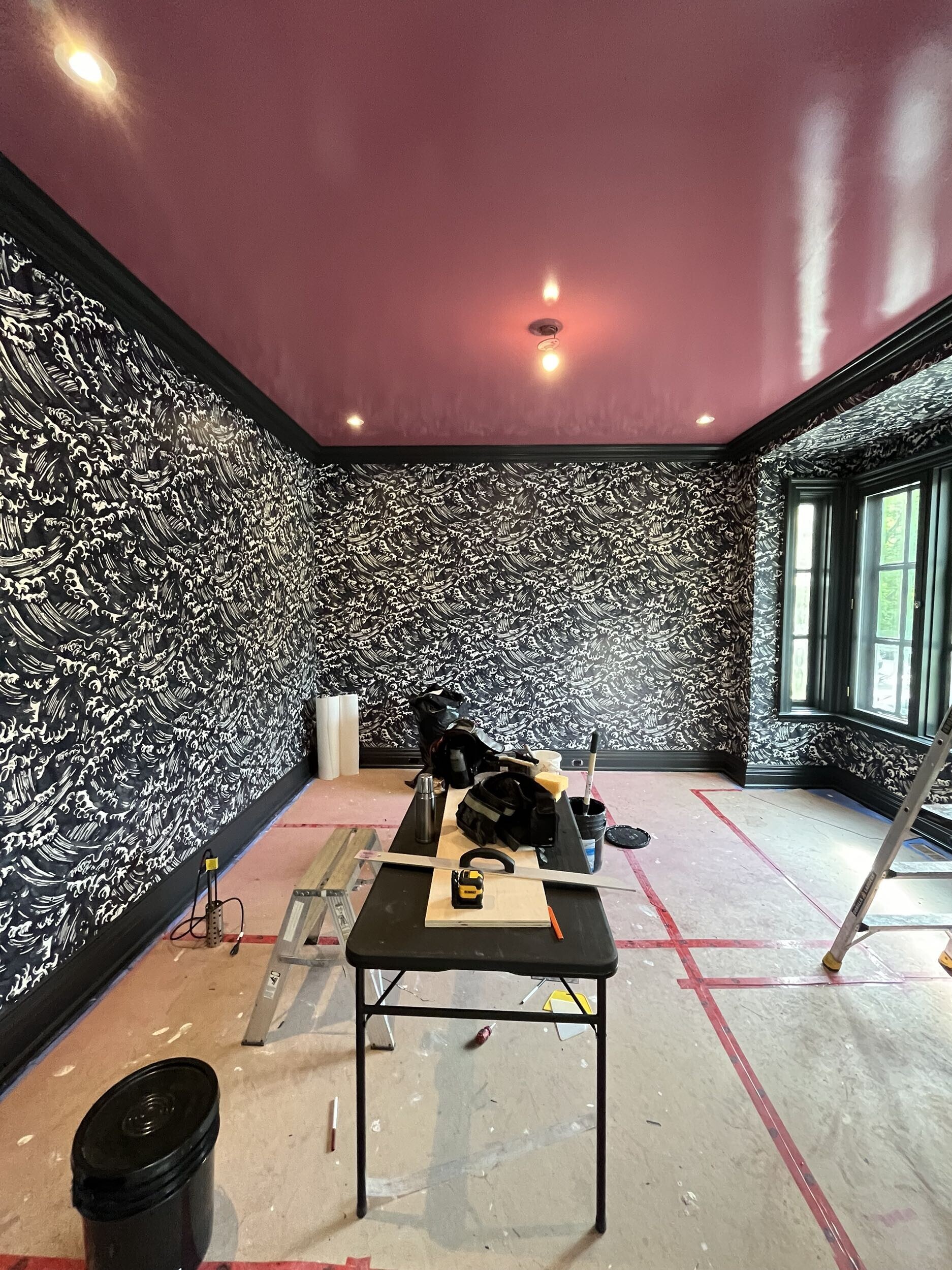
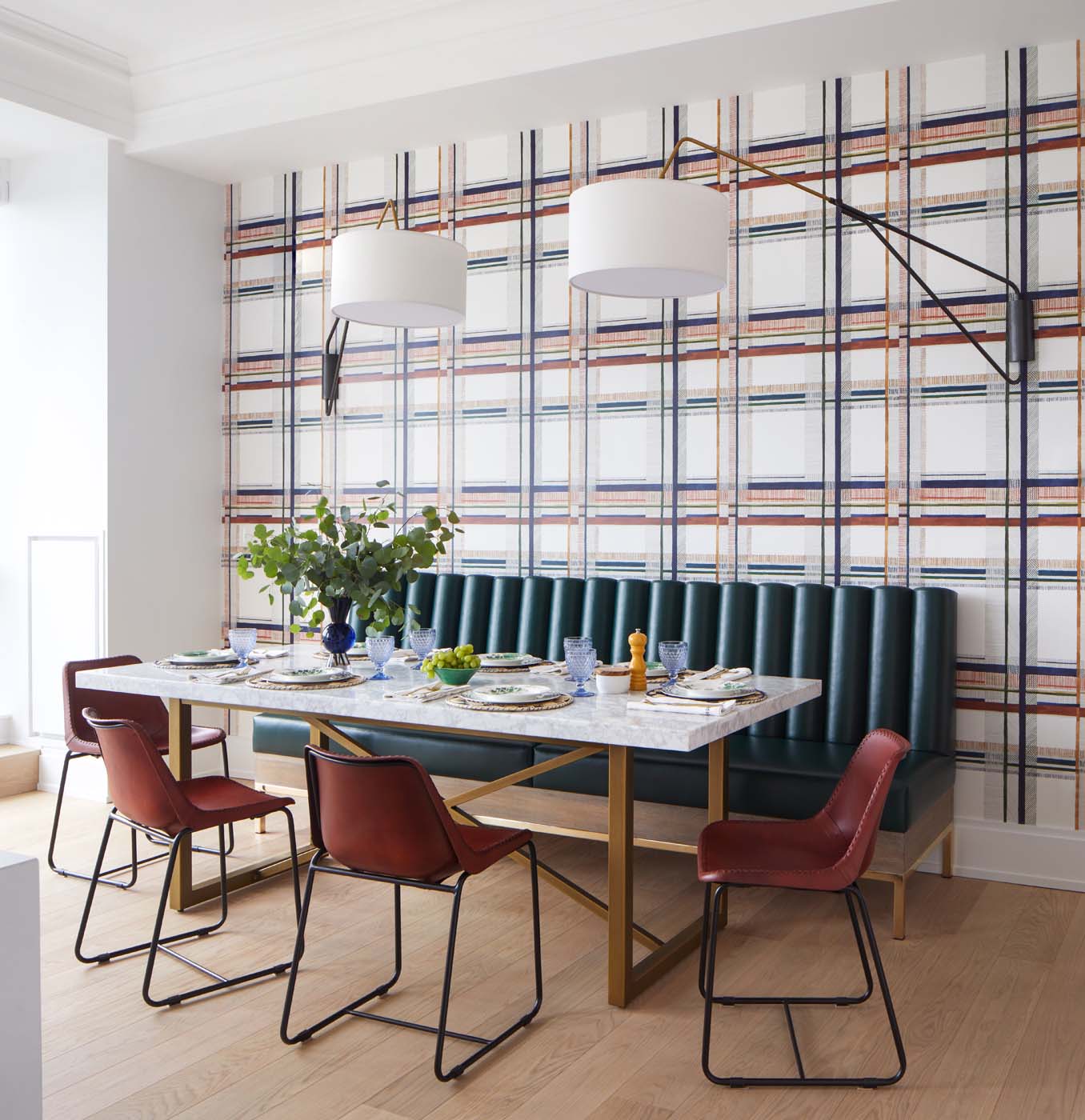
While many clients maintain the architectural integrity of their homes to match their neighbourhood and lifestyle, they are becoming less risk-averse with paint. Although Benjamin Moore’s “Chantilly Lace” remains popular, we are thrilled to see bolder colours appearing on walls and cabinetry. These colours often highlight the veining in stone countertops or subtle details in fabrics and wallcoverings. Playfulness with paint finishes is also on the rise. Lacquer has become incredibly popular on cabinetry and doors, which are rarely left white. Ceilings, too, offer a great opportunity for colour and texture play, adding a welcome surprise element to a space.
Bold Prints & Patterns
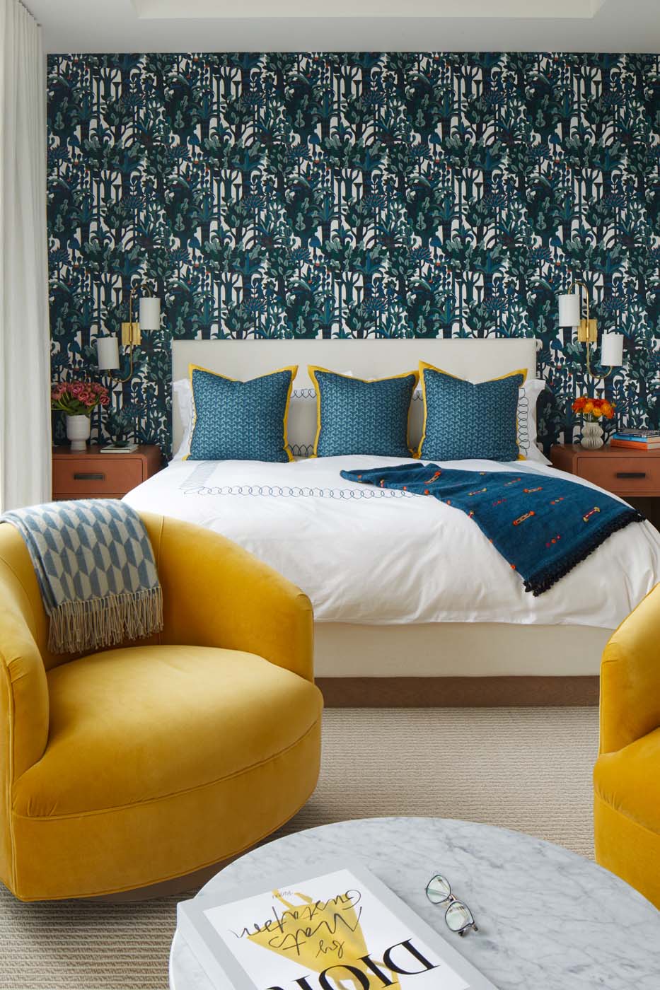
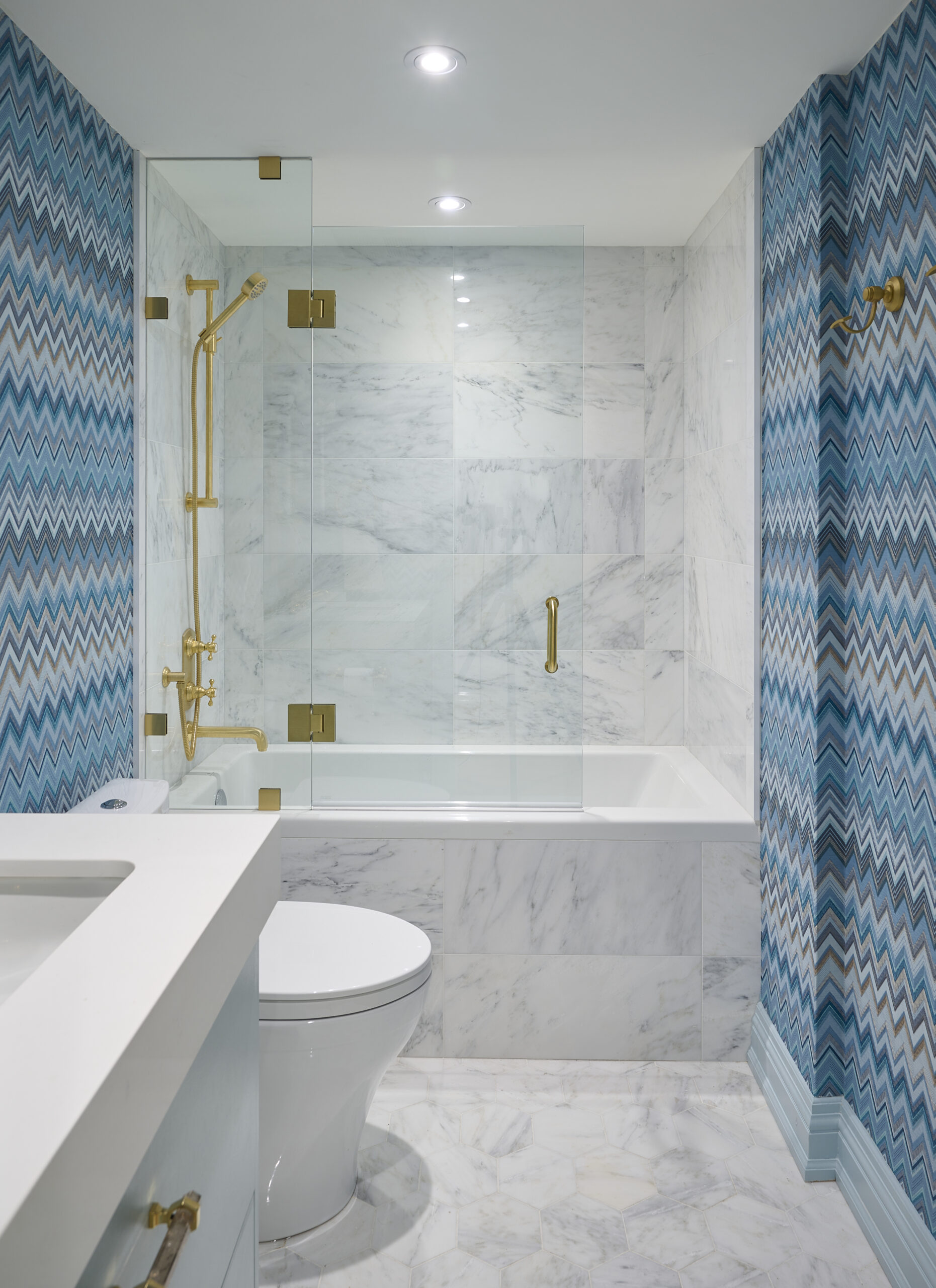
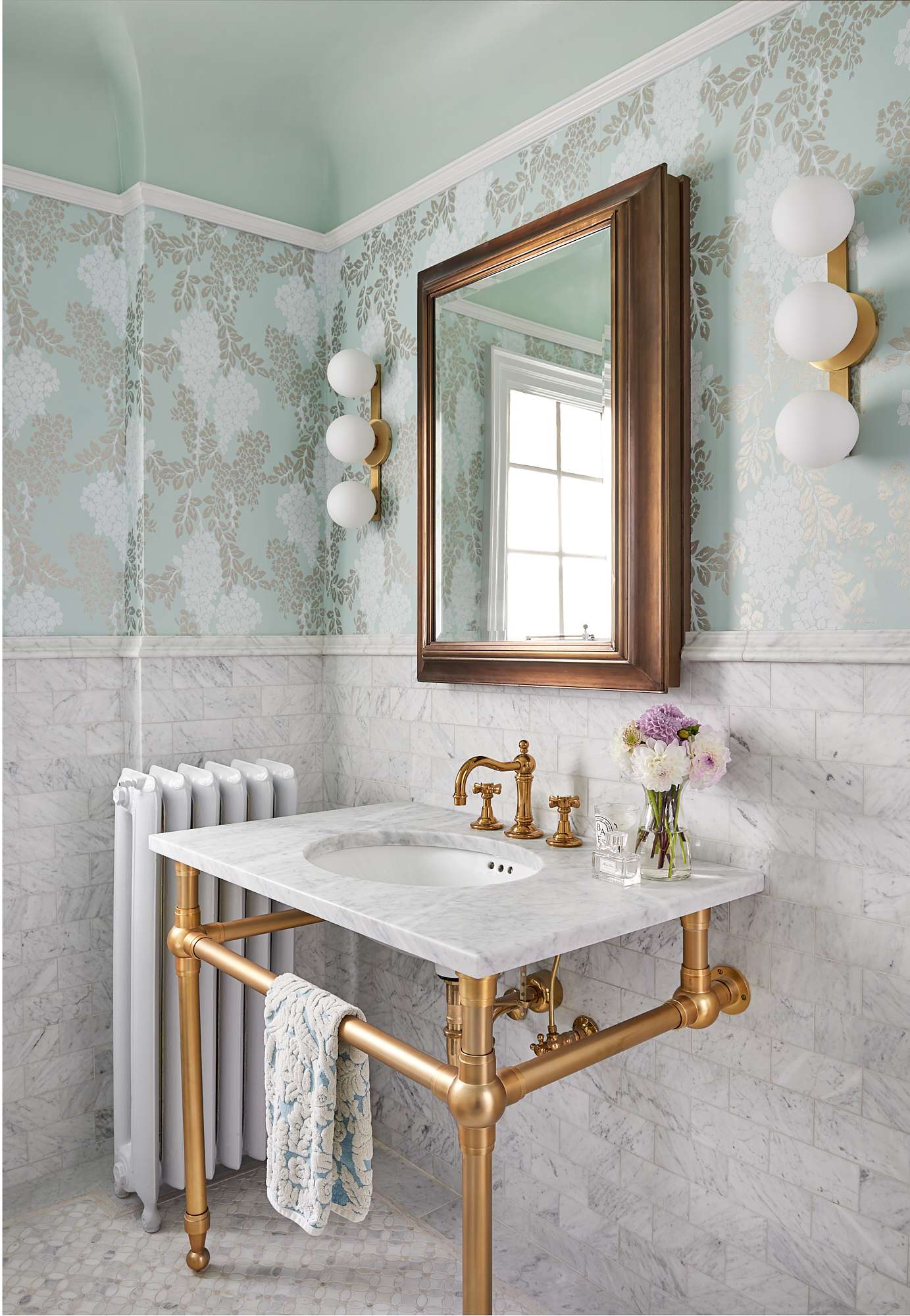
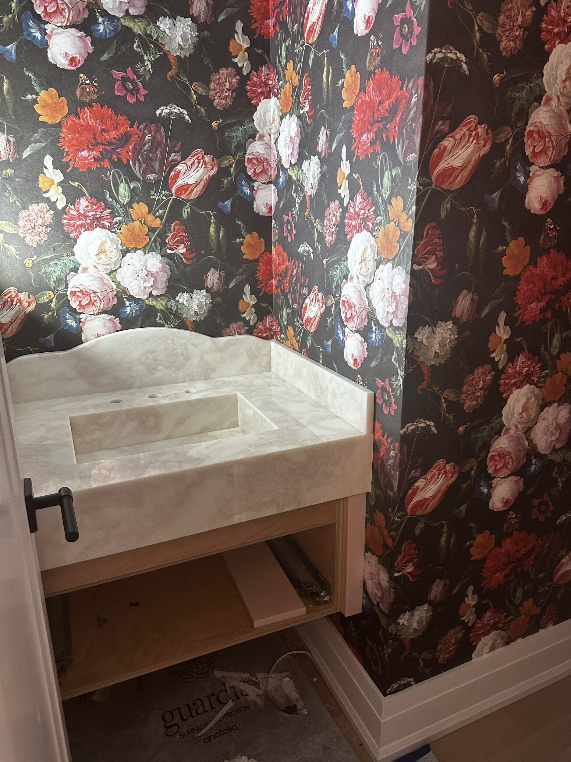
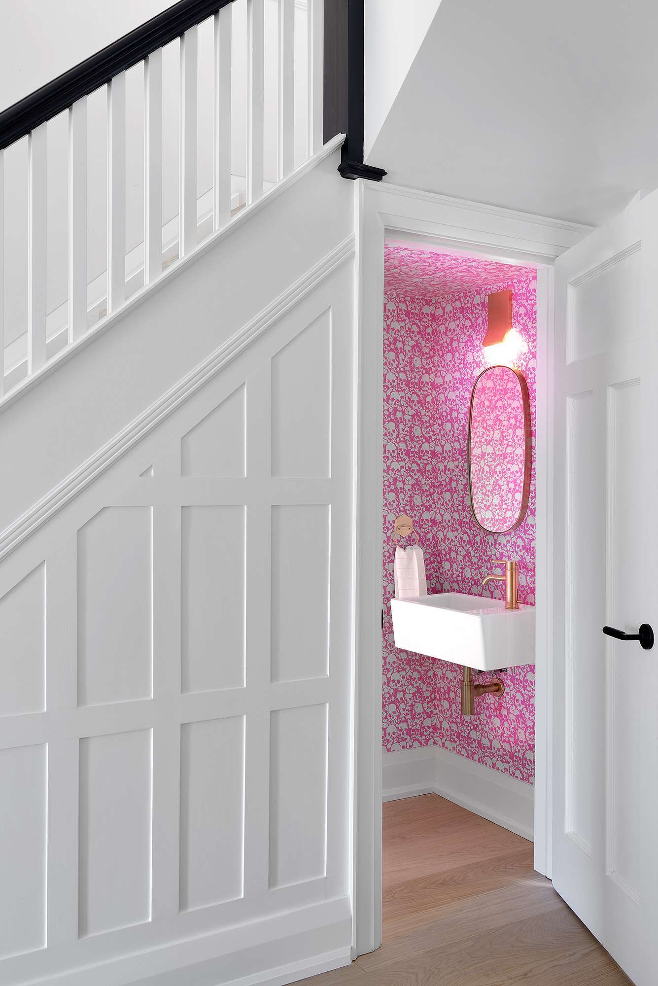
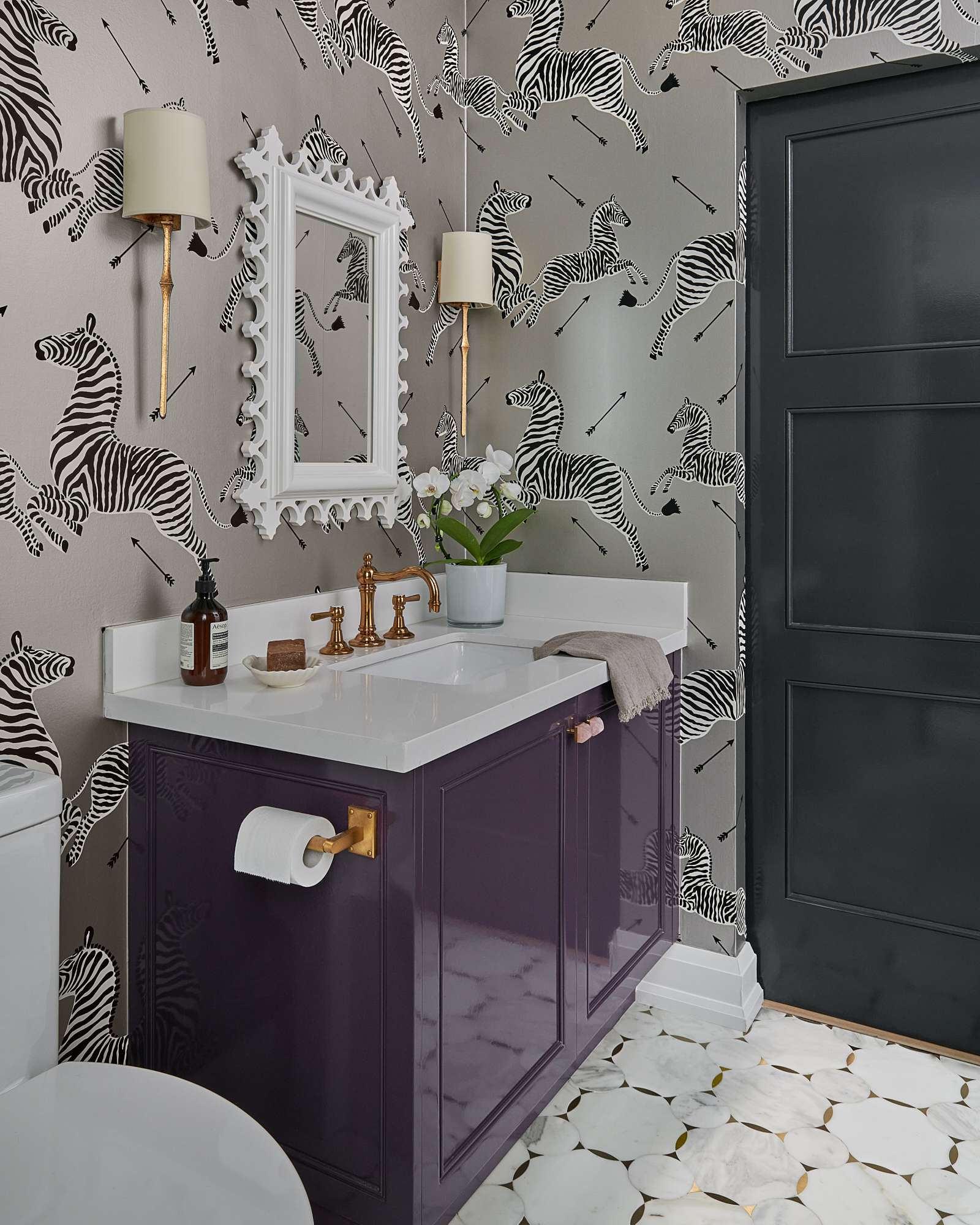
Wallcoverings have always been around, but clients were often hesitant to go beyond single-hued textural papers like grasscloth. Today, the sky is the limit. We’ve seen bold abstract designs, whimsical creature prints, full-panel murals, botanical sceneries and beyond. Regardless of the room category, exploring wallcovering possibilities is worthwhile as each one lends its own personality and flair to the space.
Thinking Beyond Carrara Marble
For years, the classic white marble with soft grey veining, Carrara, has dominated countertops, backsplashes, and tables. While Carrara remains a timeless option, it is only one of countless choices for stone finishes. In a recent episode of our podcast, Beyond Four Walls, co-founders Natasha and Luca discussed the emergence of colourful stones like Calacatta Verde with Sylvia Benchimol and Daniel Sultan of Stonetile. This shift towards more colourful and heavily veined natural stone creates a significant impact in every project.
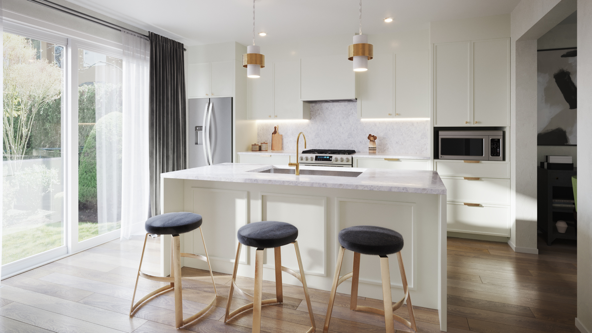
Accessorizing with Hardware & Light Fixtures
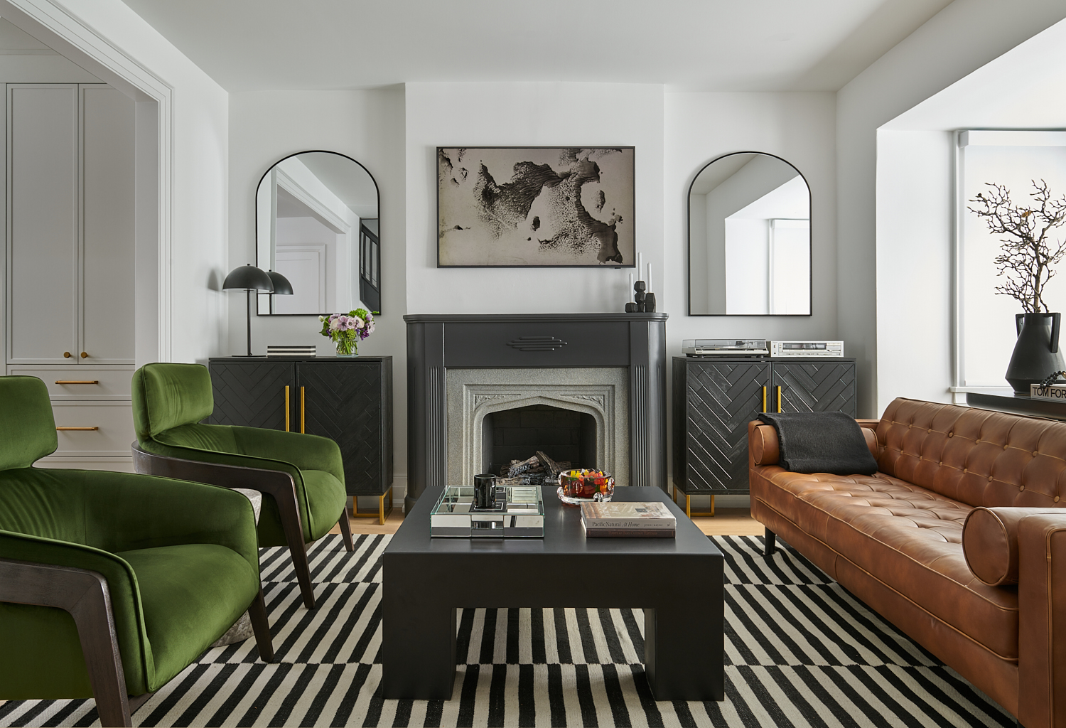
Hardware and light fixtures have always been essential in design and build projects, but they were often treated as mere checklist items. Recently, with a plethora of fabulous and innovative products on the market, we’re excited to see our clients thoughtfully selecting these elements to enhance their spaces further. From door handles to powder room knobs, the options go far beyond brass or nickel. We’ve used marble handles, matte black knurled handles, and knobs adorned with natural stones like rose quartz and malachite from Matthew Studios. Lighting collections have come a long way too and are a great opportunity to set the mood and create “wow” moments throughout your home.
At the end of the day, you don’t know what you don’t know, so we always encourage clients to “get out there” and find inspiration that speaks to them. Travel, visit showrooms, and take note of what resonates with you in friends’ homes, hotels, or something you see online, on Instagram, or in a movie! All these resources help inform your personal aesthetic. Failing that, consult with industry professionals who are “in the know.” We are passionate about design and always eager to set up complimentary consultations to discuss your vision for your home!
As each year passes, the UB team observes trends and aesthetics come and go. Generally, from a global perspective, Toronto tends to lean towards a more “safe” and conservative place on the design spectrum. Perhaps the long winter months and lack of sunshine draw us towards neutral tones. Whatever the reason, in the words of Bob Dylan, “The times they are a changin’.” We are witnessing a significant shift in our clients’ willingness to venture beyond the safe zone of 50 shades of grey and white! No longer limited to interior design magazines, perspectives have broadened with access to a plethora of design inspirations. Our clients now share magazine cut-outs, Pinterest boards, saved Instagram photos, and their travel photos, often from outside the continent. This shift not only results in exhilarating finished projects but also drives our creativity and motivates us to constantly innovate and push boundaries.
Here’s some of what we’ve seen so far in 2024:
Throughout the home, custom doors with a circular design elevate the ambiance, adorned with Emtec brass and marble hardware and handles. Behind these doors lie hidden treasures, like the blue Missoni jewel box—a vibrant oasis born from our client’s love for this captivating wallcovering. This unexpected splash of colour infuses charm into the neutral palette, creating a guest bath that doubles as a powder room fit for discerning company. Pulling from one of the various blue hues in the wallcovering, we colour-matched paint for the custom vanity, as well as the door frame and baseboard. Plaster white sconces by Julie Neill sourced from Visual Comfort flank the gold-frame mirror adding femininity, while Matthews Studio pulls with brass and amber crystal add a particularly special ornamental element.
In the master bath, a neutral palette reigns supreme, while intricate details steal the spotlight. A marble mosaic floor with mother-of-pearl inlay exudes sophistication, complemented by Perrin & Rowe fixtures from England, marrying timeless elegance with modern functionality.
Experimenting with Paint
While many clients maintain the architectural integrity of their homes to match their neighbourhood and lifestyle, they are becoming less risk-averse with paint. Although Benjamin Moore’s “Chantilly Lace” remains popular, we are thrilled to see bolder colours appearing on walls and cabinetry. These colours often highlight the veining in stone countertops or subtle details in fabrics and wallcoverings. Playfulness with paint finishes is also on the rise. Lacquer has become incredibly popular on cabinetry and doors, which are rarely left white. Ceilings, too, offer a great opportunity for colour and texture play, adding a welcome surprise element to a space.
Bold Prints & Patterns
Wallcoverings have always been around, but clients were often hesitant to go beyond single-hued textural papers like grasscloth. Today, the sky is the limit. We’ve seen bold abstract designs, whimsical creature prints, full-panel murals, botanical sceneries and beyond. Regardless of the room category, exploring wallcovering possibilities is worthwhile as each one lends its own personality and flair to the space.
Thinking Beyond Carrara Marble
For years, the classic white marble with soft grey veining, Carrara, has dominated countertops, backsplashes, and tables. While Carrara remains a timeless option, it is only one of countless choices for stone finishes. In a recent episode of our podcast, Beyond Four Walls, co-founders Natasha and Luca discussed the emergence of colourful stones like Calacatta Verde with Sylvia Benchimol and Daniel Sultan of Stonetile. This shift towards more colourful and heavily veined natural stone creates a significant impact in every project.
Accessorizing with Hardware & Light Fixtures
Hardware and light fixtures have always been essential in design and build projects, but they were often treated as mere checklist items. Recently, with a plethora of fabulous and innovative products on the market, we’re excited to see our clients thoughtfully selecting these elements to enhance their spaces further. From door handles to powder room knobs, the options go far beyond brass or nickel. We’ve used marble handles, matte black knurled handles, and knobs adorned with natural stones like rose quartz and malachite from Matthew Studios. Lighting collections have come a long way too and are a great opportunity to set the mood and create “wow” moments throughout your home.
At the end of the day, you don’t know what you don’t know, so we always encourage clients to “get out there” and find inspiration that speaks to them. Travel, visit showrooms, and take note of what resonates with you in friends’ homes, hotels, or something you see online, on Instagram, or in a movie! All these resources help inform your personal aesthetic. Failing that, consult with industry professionals who are “in the know.” We are passionate about design and always eager to set up complimentary consultations to discuss your vision for your home!

